This one’s been long in the brain, finally out on (proverbial) paper. John Walker of Kinetix Hosting was gracious enough to give me the opportunity to advertise in a local restaurant ‘guild’ magazine, so I put this together for my ever-coagulating design company.
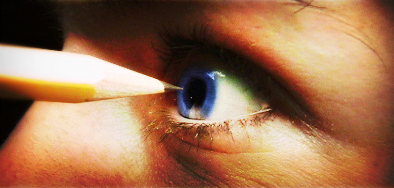
The eye belongs to my gracious fiancee Jessica, and before you’re up in arms about pre-spousal abuse, this is a clever Photoshop trick. I photographed the pencil near her closed eye, then keeping the camera where it was, I moved the pencil and she opened her eye. Then I simply cut the pencil from shot#1 and pasted it to shot#2 (with a bit of blurring at the bottom of the pasted pencil). Other modifications: a feathered gaussian blur on the pencil (creating the illusion of focal blur); a very carefully placed reflection of the pencil in the eye (spherized and transformed); colorization of the pupil (the original color wasn’t at saturated). I also created a duplicated layer of the photo, blurred it about 5px and set the layer for overlay, giving it that “burned” look.
A design friend of mine said it had a bit too much of the “horror slasher film feel.” Now that I look at it again, maybe it’s true. It’s due today, so there’s no turning back. I suppose the inbox and voice mail will the final judge.