Redesigning a website is like having a baby. It’s exhilarating and fun when you’re in the planning stages; but when it comes right down to it, it takes a lot of hard work and sleepless nights to see it through to completion and do it right.
I couldn’t think of a better way to start this blog than by chronicling my own redesign. Some would call it a reboot or a realignment, but those terms imply that what I started with was accomplishing my goals and simply needed some freshening up. Nothing could be further from the truth. I originally designed my site with little consideration of the site’s purpose or the overall feel I was communicating. I needed a redesign, and this particular gestation period was well over two years.
The Logo, or The Window To Your Brand’s Soul
That’s right, the logo is absolutely the most important part of your design.
It’s almost like trying boil down into a single phrase what your business/site/cause is all about. The subtleties are everything. Ever wonder why designers obsess over serifs (the little nubs on fonts like Times New Roman) and kerning (the spacing between letters in a proportional font)? Because those little nuances communicate a great deal about your brand, especially in you’re logo.
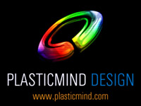
Take a look at my original Plasticmind logo, circa 2003:

Much as I hate to, I will publicly confess that this was actually something I got from a crop circles dingbat font. You know what they say: if you can’t design, browse clipart! (Right, Elise?) There’s not much significance or cohesion to it; it just is. And on top of communicating nothing about my brand, the rainbow colors and beveling make it nearly impossible to use for print. In all fairness, Plasticmind Design wasn’t an official company until July of 2005; let’s just say I was having commitment issues.
Plasticmind, Macho
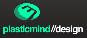
When the time came for the Plasticmind Design brand to settle down and start a family, I knew I couldn’t rely on someone else’s clipart as a logo. So I put together what I like to call Plasticmind, Macho:

Unless this is your first time here, I’m sure you’ve seen it before. I see it on my ceiling every night because it’s burned into my retinas. This particular iteration has gone untouched for two years on my main site.
It’s not a bad logo, by any stretch. As you can probably guess, it’s an amalgam of the P and the M. (Coming up with visuals for Plasticmind is not easy.) I originally designed it with dark classic colors and glossy metal because I had just started my business and had very little experience; I wanted to communicate strength and stability. Apparently, it served it’s purpose.
Logo As Fair Representation
But a conversation I had with a client last year really surprised me. She told me that when she hit my site, she was actually turned off by the harsh, masculine feel and sharp, glassy edges. She assumed that I would be hard to work with and probably somewhat arrogant. Anyone who has ever worked with me knows that’s the furthest from the truth. I’m a really laid back guy and I’m extremely flexible.
So the problem with this logo is that while it served a purpose, it wasn’t a fair representation of me. And that really brings me back to this whole idea of purpose: what are you trying to accomplish with your brand? Or rather, what are you trying to communicate? Are you traditional and predictable? Are you unorthodox and spontaneous? Young or old? Believe it or not, these concepts can shape a logo.
In fact, take a look at the next iteration of the Plasticmind logo:

Before I even started up Photoshop, I had decide what I was all about. How do I want to be perceived? How am I already being perceived? I took Lealea’s advice and asked around. The general consensus was that I was really easy going but that my work was very clean and understandable. So how does that translate visually?
First, I took the sharp edges off and gave it rounded corners. I also took the tail of the ‘P’ as I felt it was too blatant and it killed the symmetry of the shape. The previous font was very militaristic, all caps, in your face. So I added some white space to help further communicate that clarity.
Let The Mockups Begin
I did several full redesigns with this iteration of the logo. This will give you an idea of the broad range I was still playing around with:
The Great New Logo That Doesn’t Work
Finally, I realized the logo just wasn’t right. It was far too generic. Doesn’t matter how long I agonized over the proportions; it still looked like it took 5 minutes to doodle up in Illustrator. It was communicating simple, but not attention to detail.
So I did some sketching and came up with this:

I was ecstatic. It gave me the rounded edges I wanted but also carried over the ‘M’ from the previous design; I even lengthened the last leg of the ‘M’ to convey outside the box thinking. And to top it all off, this was a hat tip to a great font on it’s anniversary. (Happy 50th, Helvetica!) This was the incentive I needed. I researched all sorts of beautifully clean, Swiss-inspired design while drawing up the mockups.
There was only one problem.
It didn’t work. No one got the logo. Everyone asked me what the ‘E’ inside the Skittle was for.
Pushing Yourself, or The Final Product

But it didn’t much matter at this point. The Helvetica-based design had already reached critical mass and the final logo came rather quickly.
I reverted back to the previous iteration, only with three corners sharp and the final leg of the ‘M’ pushing out of it’s boundaries: clean, proportioned design with a hint of rounded edges and a propensity to go outside the box.
Couldn’t have said it better myself.
Tune in next time as we talk about the modular CSS approach that makes creating new sites with similar layouts a breeze.


