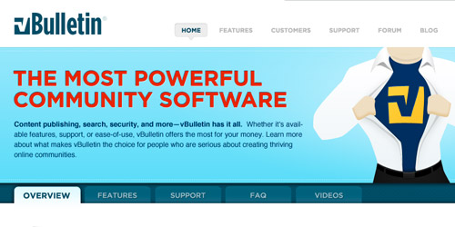
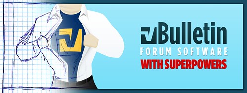
The vBulletin.com redesign was a particularly enjoyable project—it’s not that often you get to help shape the branding of a tool you frequently work with.
The goal of this project was simple but crucial: breathe new life and energy into the vBulletin branding without alienating almost 10 years worth of loyal customers (can you believe it’s been almost ten years!).
The first few rounds we played it a bit too safe: corporate blues and oranges. But the team reiterated their goal: breathe new life and energy into the brand. That’s when the superhero theme came to me—bold, whimsical and a bit irreverent. I literally woke up one morning with the image in my head, ran down to my office and sketched it out. (Channeling the jQuery rockstar perhaps?) Once the superhero cornerstone was settled, all the other design pieces began to fall into place.
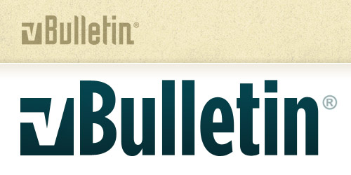
As for the logo, Gotham Condensed felt like the perfect fit. It carries all the friendliness and populist overtones they were trying to convey with the new community features of 4.0 while still being similar enough to the old logo font so as to be familiar. The one key component of their branding they did want to keep was the checkmark V, so we recreated the mark using the basic layout from the old logo along with the ‘v’ letterform from the new font.
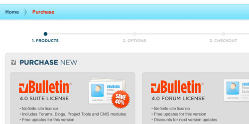
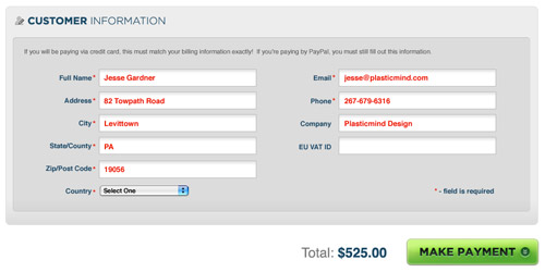
The shopping cart was a particularly time-consuming piece. The vBulletin team knew that the difficulty of their existing cart was costing them business, so we spent a lot of time hashing through the cart, boiling down a fairly complex set of product and support options into a much simpler three-step process.
Congratulations to the vBulletin team (specifically Jennifer Rundell, Don Kuramura and Michael Anders) for their hard work on a great site launch as well as all the hard work that went into the new vBulletin 4.0 Forum and Community suites.
