When O’Reilly cancelled ETel 2008, Lee Dryburgh fought hard to keep the community of emergent communications activists alive by organizing eComm2008. The conference was a rethink of the trillion dollar communications industry, a challenge to industry leaders who have largely remained stagnant.
Because of ETel’s last minute cancelation, Lee needed an tremendous amount of design work done in a very short amount of time: identity design, information architecture, marketing artwork and a conference site built on Movable Type Community Solution. It was such a pleasure to be involved with the creative process from start to finish: crafting the eComm logo back in November, designing PowerPoint templates in January for presenters, coming up with artwork for swag in February, the final push to create conference materials like signs and program guides and then ultimately seeing all those creative decisions and hard work up on stage adding punch to an already monumental conference.

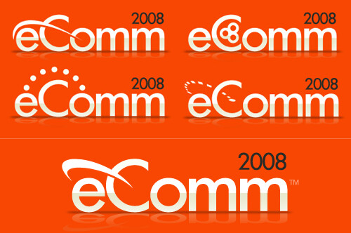
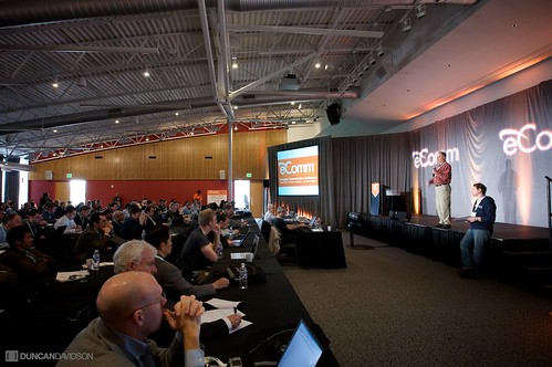
The key concept for the conference was connectivity—social and technological. So I wanted that to be a prominent theme in the logo. You can see I started early (top left) with that concept. The next iteration (top right) was more a cross section of pipes, but didn’t communicate connectivity well. The dots in draft 3 brought us back to the idea of connectivity, but with the concept of packets. However, the broken lines in drafts 3 and 4 carried too much negative connotation (sporadic, spotty). Draft four did introduce a very pleasing perspective that I melded with the swoop from draft one to get the finished logo that you can see in the great photos that James Davidson took of the conference.


Be sure to stop by James Duncan Davidson’s website to read his recounting of the conference and visit his eComm2008 Flickr set.
Congratulations to Lee, Nancy, Shane, and everyone else who worked tirelessly to make eComm2008 happen.

