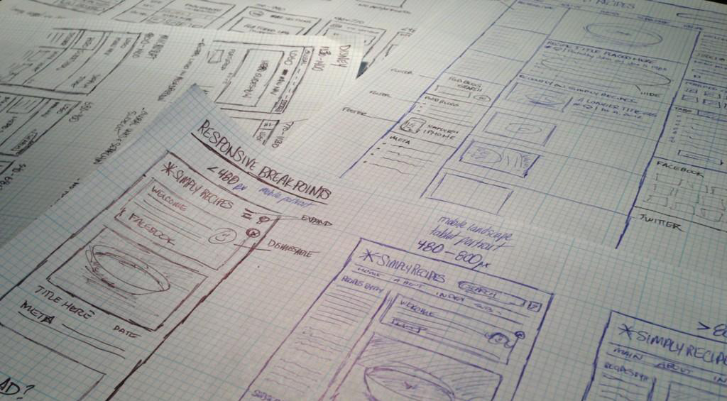
We’ve got a Simply Recipes redesign on the horizon, and one of the priorities for this new design will be making it responsive.
The first thing I did in preparation for the redesign was to scour the web for the “magic breakpoints”—the specific widths I should be targeting with the new design. However, the consensus seems to be that the breakpoints you should target with your design are almost entirely dependent on your site’s content and design. Responsive design, like all other design, is about solving specific challenges, and in this case, the primary challenge is figuring out how to fit your content into a fluid viewports while still keeping it useable and compelling.
With that in mind, I decided to look at some popular responsive designs and evaluate how they’ve solved the design challenges associated with their respective content and layout. I decided to record this “case study light” since I figured this kind of a real-time evaluation might be beneficial for others. The sites I look at in the video: Smashing Magazine, Microsoft, Disney and Food Sense Note:
Feel free to pass along your thoughts in the comments!
Evaluating 4 Responsive Designs on Vimeo.